
Painting a wall isn't just a matter of choosing a pretty shade. Behind every color lies an impact, an emotion, even a reaction that can influence how we experience a space. This is what color psychology studies: how colors affect how we feel, how we perceive our surroundings, and even how we behave in our own homes.
And if you're thinking about a renovation, this makes perfect sense. Because it's not just about aesthetics. It's about making your home work for you, ensuring that each room has that "something" that makes it comfortable, pleasant, vibrant, or peaceful, depending on what you need from it.
Color can also be deceiving (for the better)
A white wall can open up a small space. A deep gray can make a large room feel more intimate. And it's not just the color itself: its brightness, saturation, and the amount of light it receives during the day also matter.
For example, a light blue is relaxing, but a darker one can get you moving. In a narrow hallway, a light, matte shade can make it feel less closed in. And if your living room is large but a bit cold, perhaps what it needs is a warm tone to embrace it a little.
How to apply color psychology well?
This isn't about following rules like a recipe. It's about understanding the purpose of each room and what you want to feel when you're there. Still, there are some key points to keep in mind:
- What is space for? A bedroom calls for peace. A kitchen calls for energy and order. An office calls for focus.
- What energy level are you looking for? If you need calm, soft or muted tones are best. If you want a little sparkle, go with something more saturated.
- And the contrast? When there is a noticeable difference between two colors that are close together (about 30 LRV points), visual depth and accessibility are gained.
- Where is the natural light? In the north, the light is cooler; in the south, it's warmer. The same color doesn't look the same in one room as it does in another. It's a good idea to test it first.
What does each color convey?
Blue: calm and clarity
Widely used in bedrooms and bathrooms. If it's clear, it encourages relaxation. If it's cooler and more moderate, it can help you concentrate.
Red: attention and movement
It has power. It's best used in details, not as a main color. In a dining room or a passageway, it can provide warmth and energy without being overwhelming.
Green: balanced freshness
It's relaxing and refreshing. It works great in both kitchens and living rooms. It provides a natural touch without being overpowering.
Yellow: light and optimism
Properly measured, it brings joy. In kitchens or work areas, it can be a great ally. But if it's too intense or used too much, it can be exhausting.
Neutrals: balance and freedom
Soft grays, beiges, warm whites… They're like a foundation that allows you to play boldly with other, more vibrant tones. They bring serenity without going unnoticed.
What if we look at it by rooms?
Bedrooms
It's all about slowing down the pace here. Soft, cool, or very muted warm colors. If you also use warm lighting and matte textures, the effect is instantly noticeable.
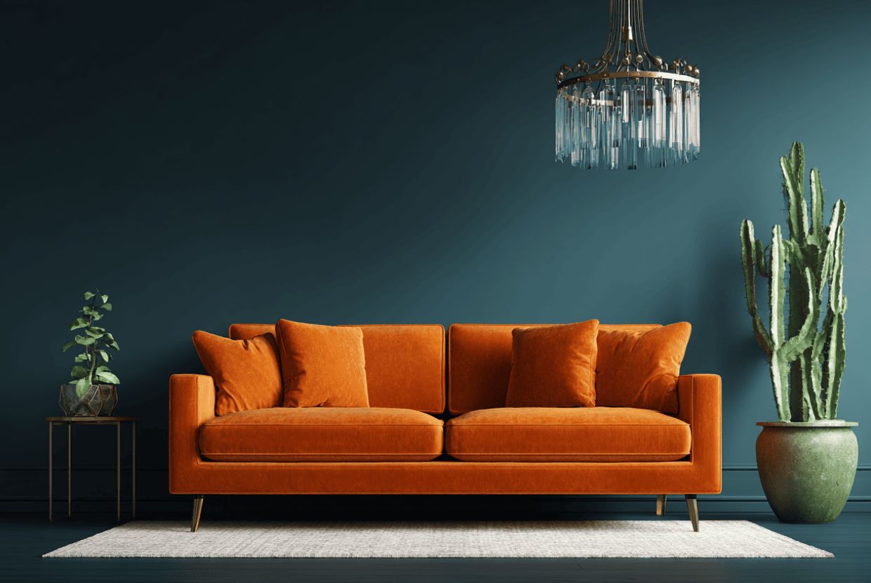
Living room and dining room
They're social spaces, where things happen. Warm, medium colors that invite you to linger. And then, small, brighter touches in pillows, art, furniture... to add character without overwhelming.
Kitchen
Here, color helps create order. Off-whites, soft greens, or light blues look clean and convey freshness. A good satin finish also helps keep everything in order.
Bathroom
If it's small, it's a good idea to choose shades with a high LRV that reflect light. Cooler shades give a clean feel. And if you have good lighting (high CRI), you'll literally look better in the mirror.
Workspace
A well-chosen blue can help you focus. A well-placed touch of red stimulates. The key is to avoid overload and avoid visual distractions.
Some technical details that are worth having on hand
- LRV (Light Reflectance Value): How much a color reflects light. It directly affects how large or bright a space appears.
- MetamerismA color you love in the store may look different in your home lighting. It's best to try it first.
- Paint finishMatte finishes absorb light and hide imperfections; satin or semi-gloss finishes reflect more light and are easier to clean.
- CRI (Color Rendering Index): The higher the value (ideally 90 or higher), the more realistic the colors appear under that light.
What is often overlooked (and later regretted)
- Choose based on fashion, not function. What you see on Instagram doesn't always fit into your daily life.
- Don't test the color on the actual site. Light changes, and so does the color.
- Going overboard with intense tones. They're exhausting, even if they're charming at first.
- Ignore lighting. You can have the perfect color… and it can still look terrible.
Tips for a renovation that feels yours
- Think about what you want to feel, rather than what is worn.
- Choose a base palette and play with details depending on the energy you're looking for.
- Consider where the natural light hits and adjust the tones accordingly.
- Choose finishes that match the use of the space.
- And yes, always test colors in natural light. It's a step that saves a lot of trouble.
At Tecnic Project we are specialists in renovations in Mallorca
At Tecnic Project, we know that remodeling isn't just about changing things. It's about transforming your home into a place where you feel like yourself, where everything fits together, from the colors to the way the light streams in through the windows.
Color psychology helps us achieve this. It's not about following fixed rules, but about listening to what you need and working together to find the shades and materials that make it possible. Our experience in comprehensive reforms in Mallorca allows us to adapt each proposal to your lifestyle and the character of your home.
If you're thinking about renovating your home and want it to look good, but also feel good, we're here. No rush, no pre-made formulas. Just attention, listening, and a desire to do it with you.


